BatchOne • 2021
BatchOne Rebrand
A brand and website refresh for a hardware consultancy that didn't look the part.
Scope
Brand identity & website
Team
Creative Director
Digital designer (me)
2 Senior Developers
Responsibilities
Research
User experience
User interface
The Situation
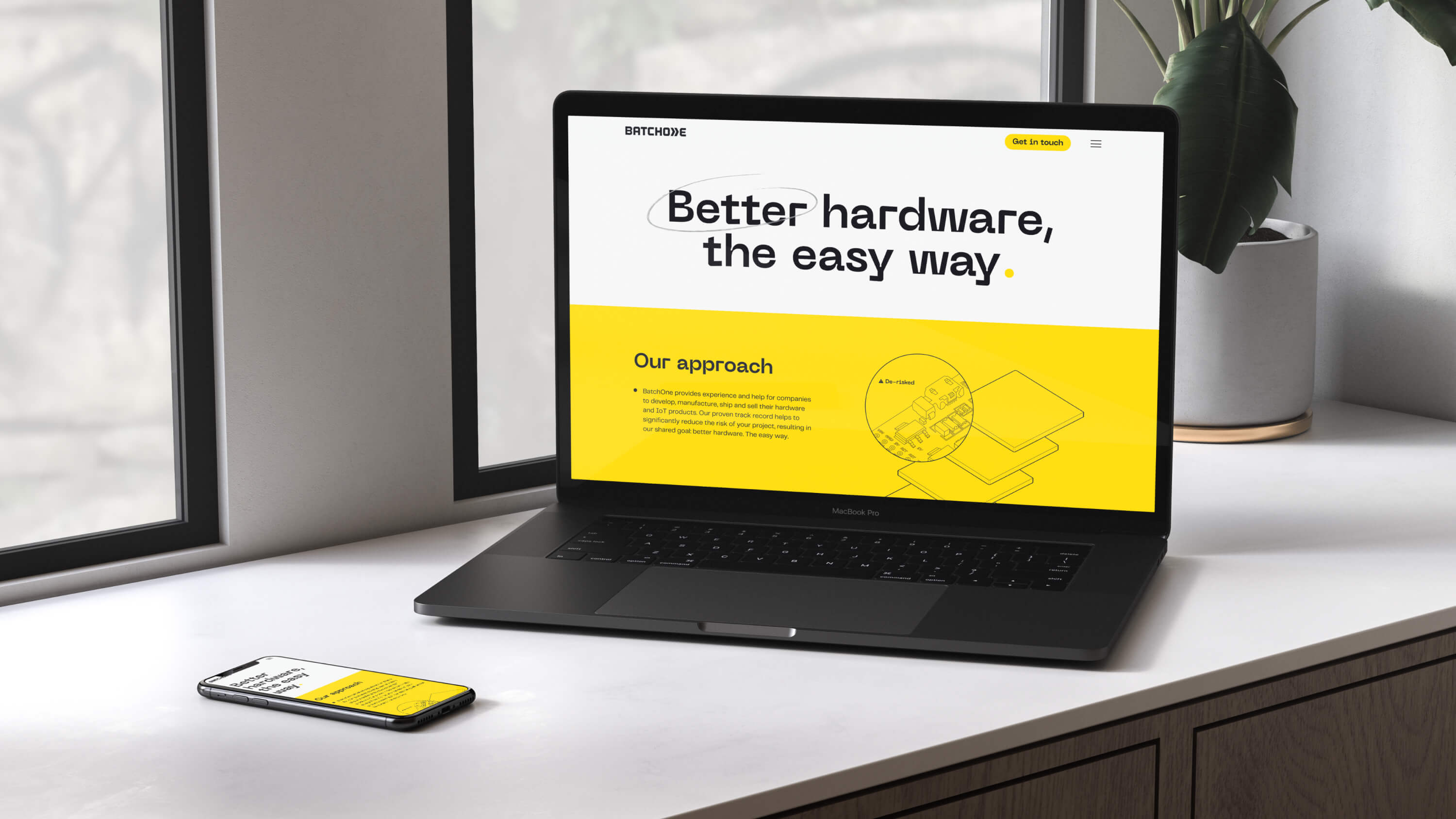
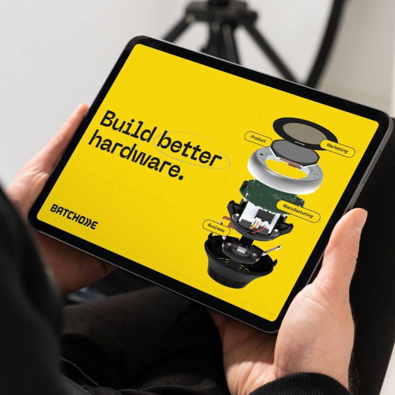
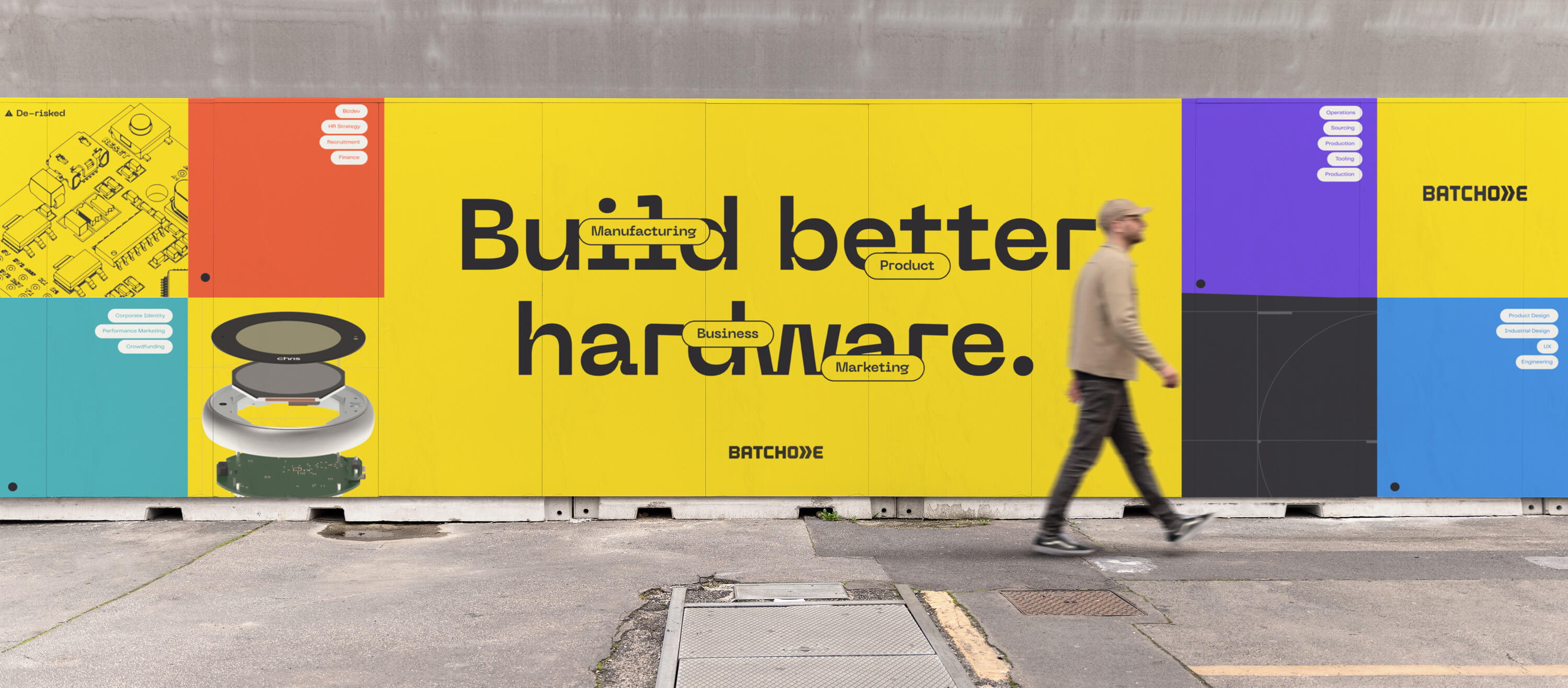
BatchOne helps companies build hardware. Not pitch decks about hardware, not concept videos — the actual physical thing, from prototype to shipped product. Their work spans product, business, manufacturing, and marketing, organized as four specialist teams that clients can engage individually or as a whole.
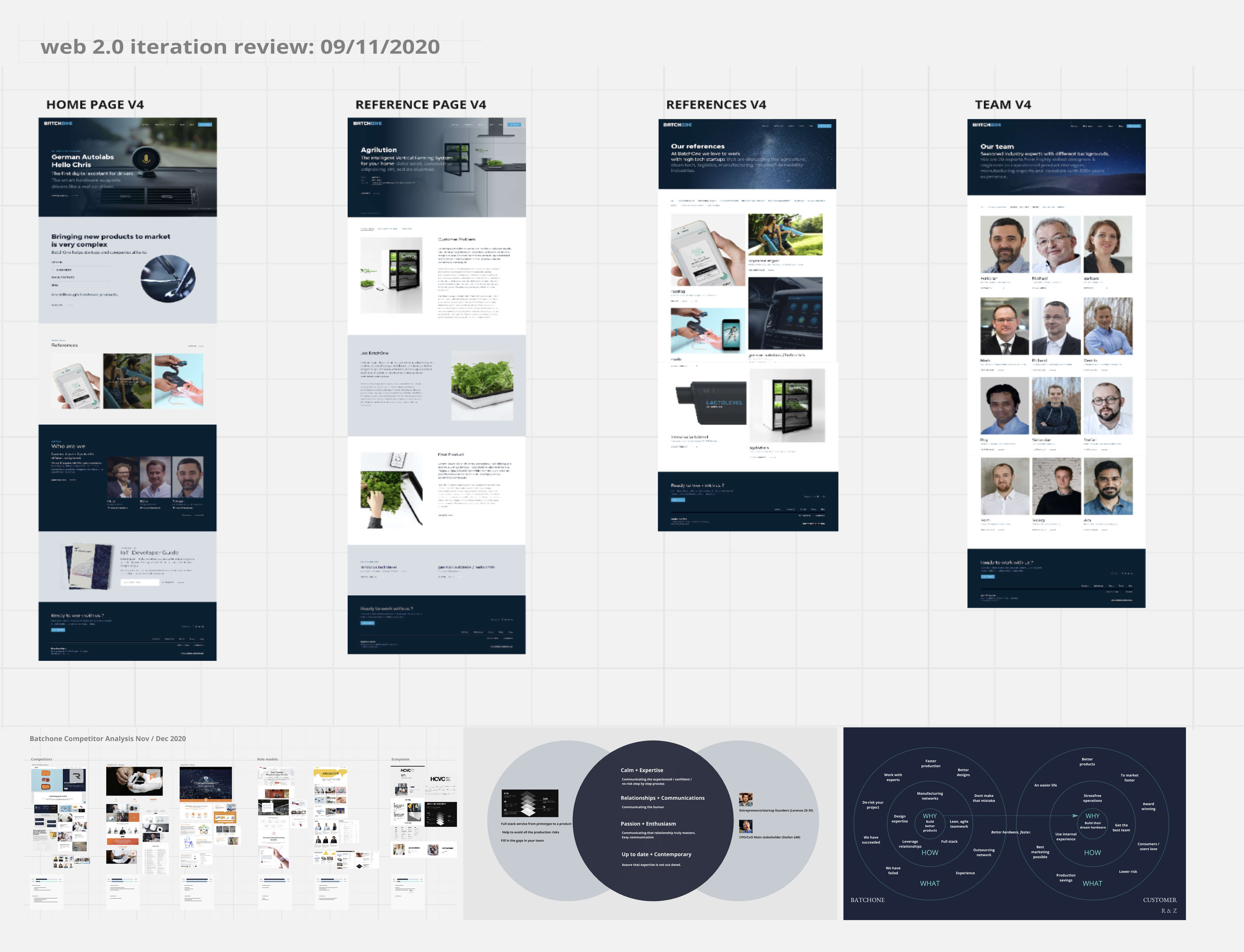
The problem: their previous site didn't show any of this. It read like a generic consultancy — calm, broad, undifferentiated. A founder visiting the site couldn't tell whether they were talking to a strategy firm, an agency, or a manufacturer. The structure that made BatchOne actually useful was invisible.
The Hard Part
Brand work is rarely about adding things. Most of it is about making decisions visible that already exist inside the company.
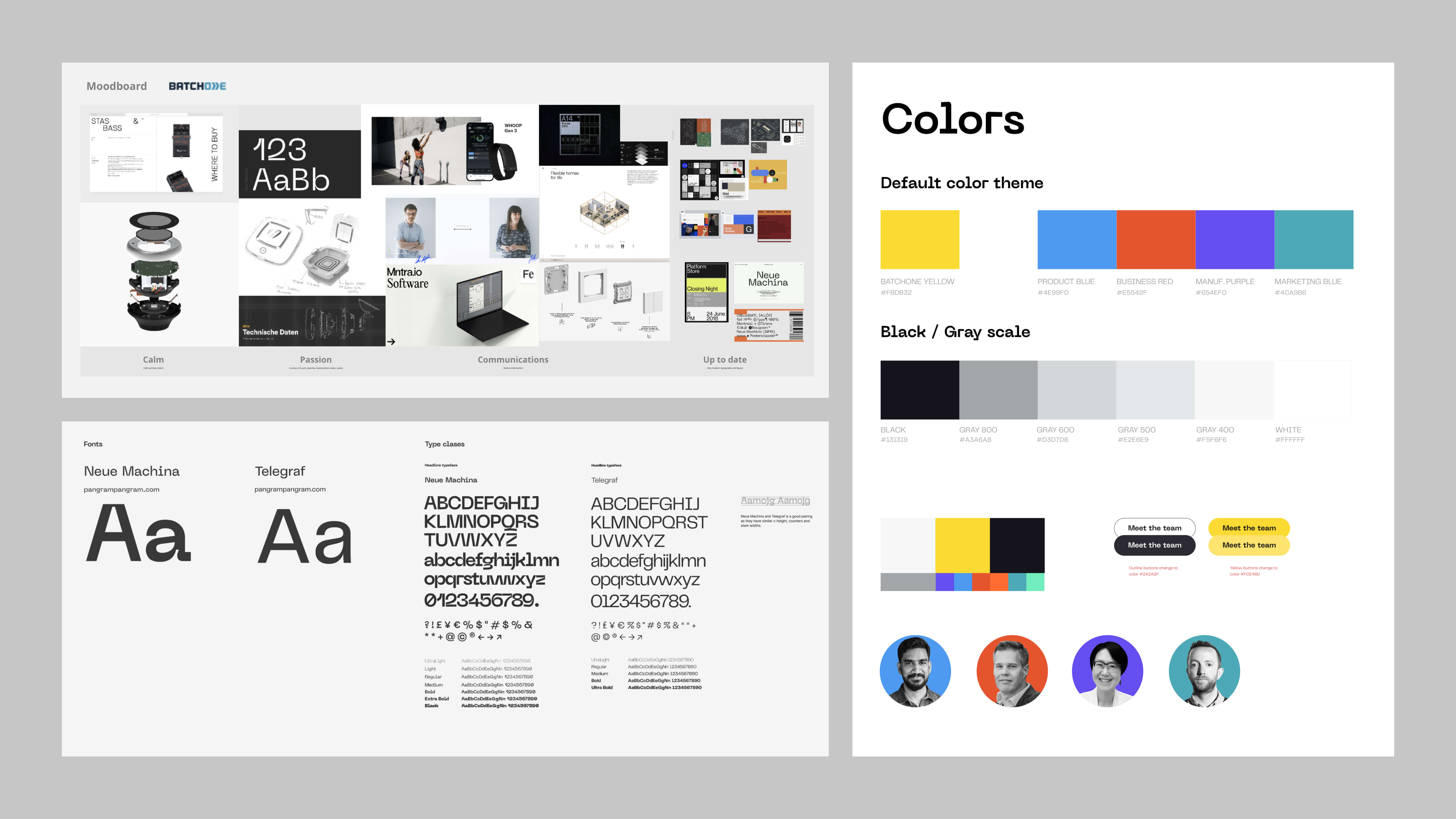
The four teams existed. The modular service model existed. The bold, fast-moving culture existed. The job was to find a visual system specific enough to express all three, without tipping into the kind of design-led-startup look that would have flattered the brand and lied about the work.
The decision came down to contrast. A muted palette would have left BatchOne where they started — hard to distinguish from any other consultancy. A maximalist palette would have undersold the technical depth. The middle was a small set of strong colors — yellow, black, and blue — used with intention rather than decoration.
What the Work Produced
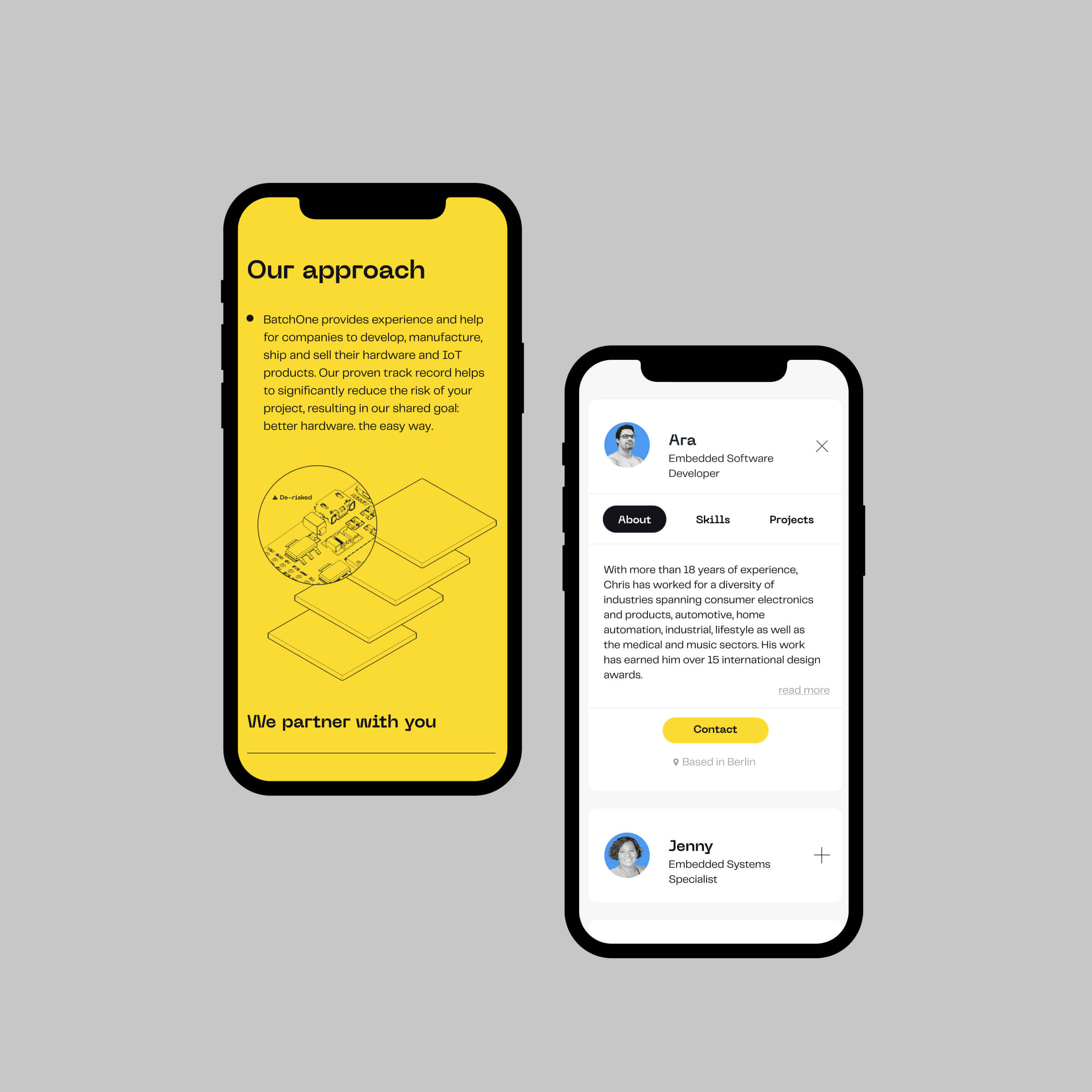
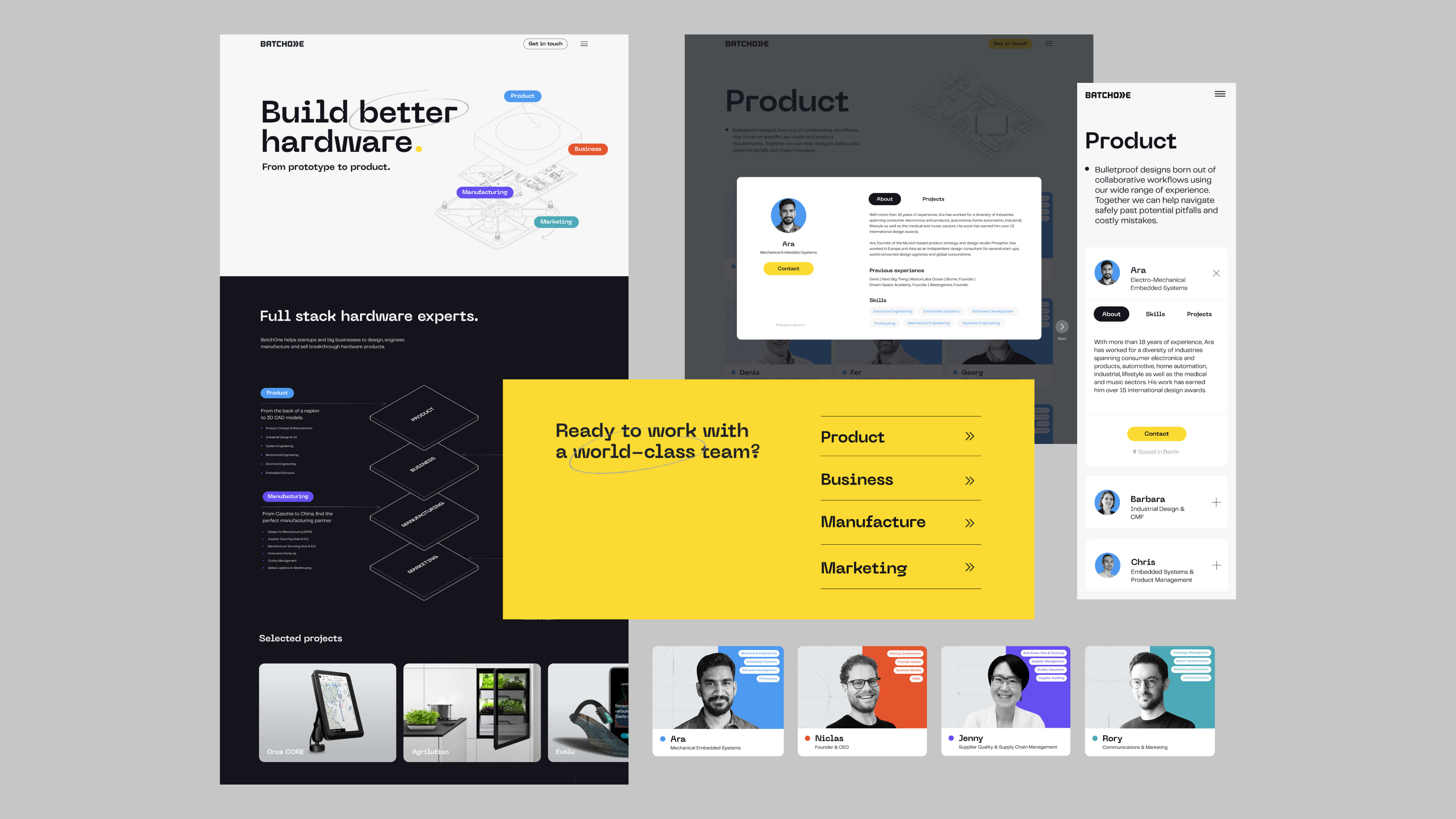
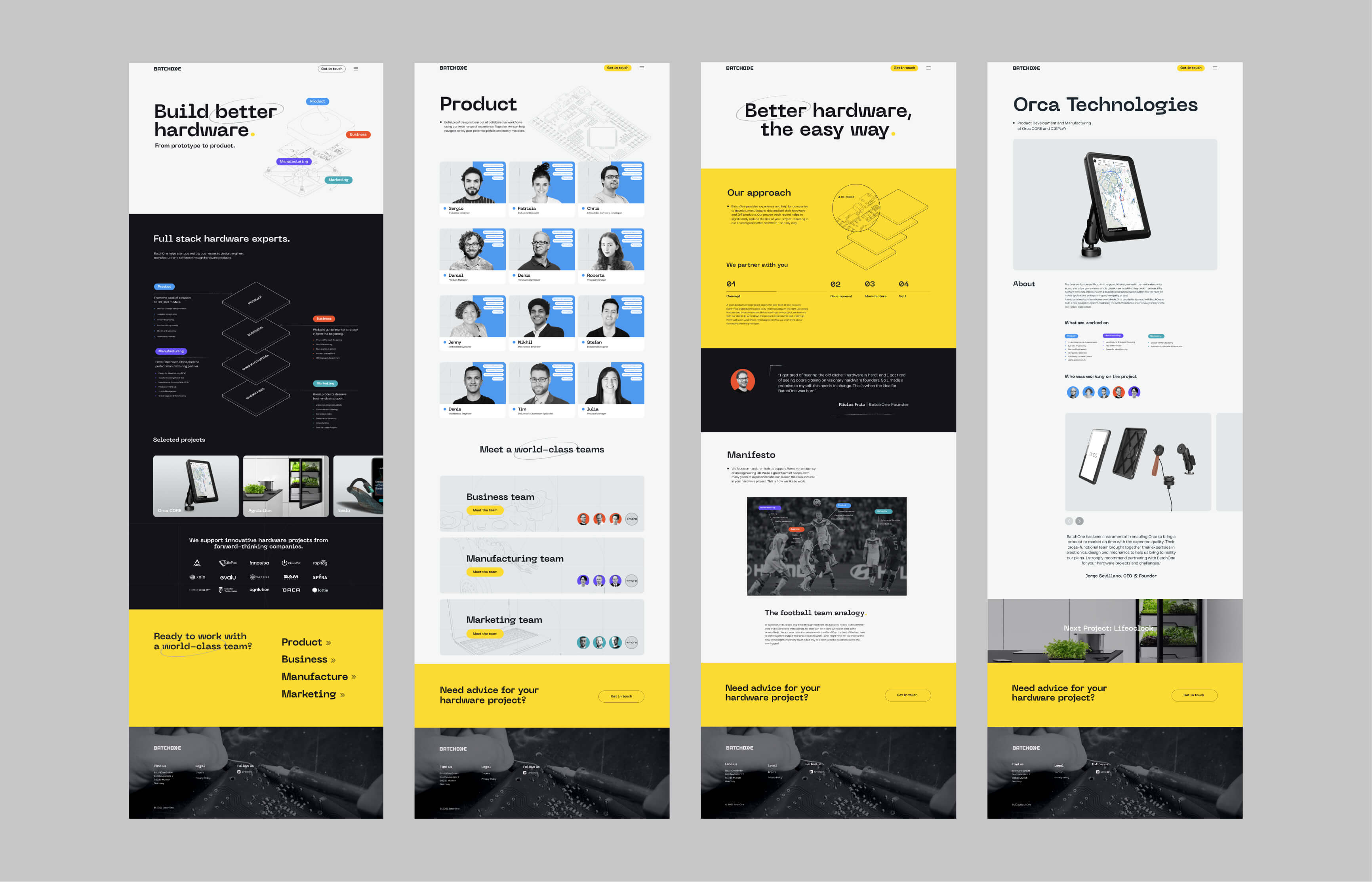
The redesign restructured the site around the four expert teams, giving each its own visual section so a visitor could trace what each team does, what stages they own, and how to engage them. The hierarchy moved from idea → team → partnership, mirroring how clients actually decide whether to work with BatchOne.
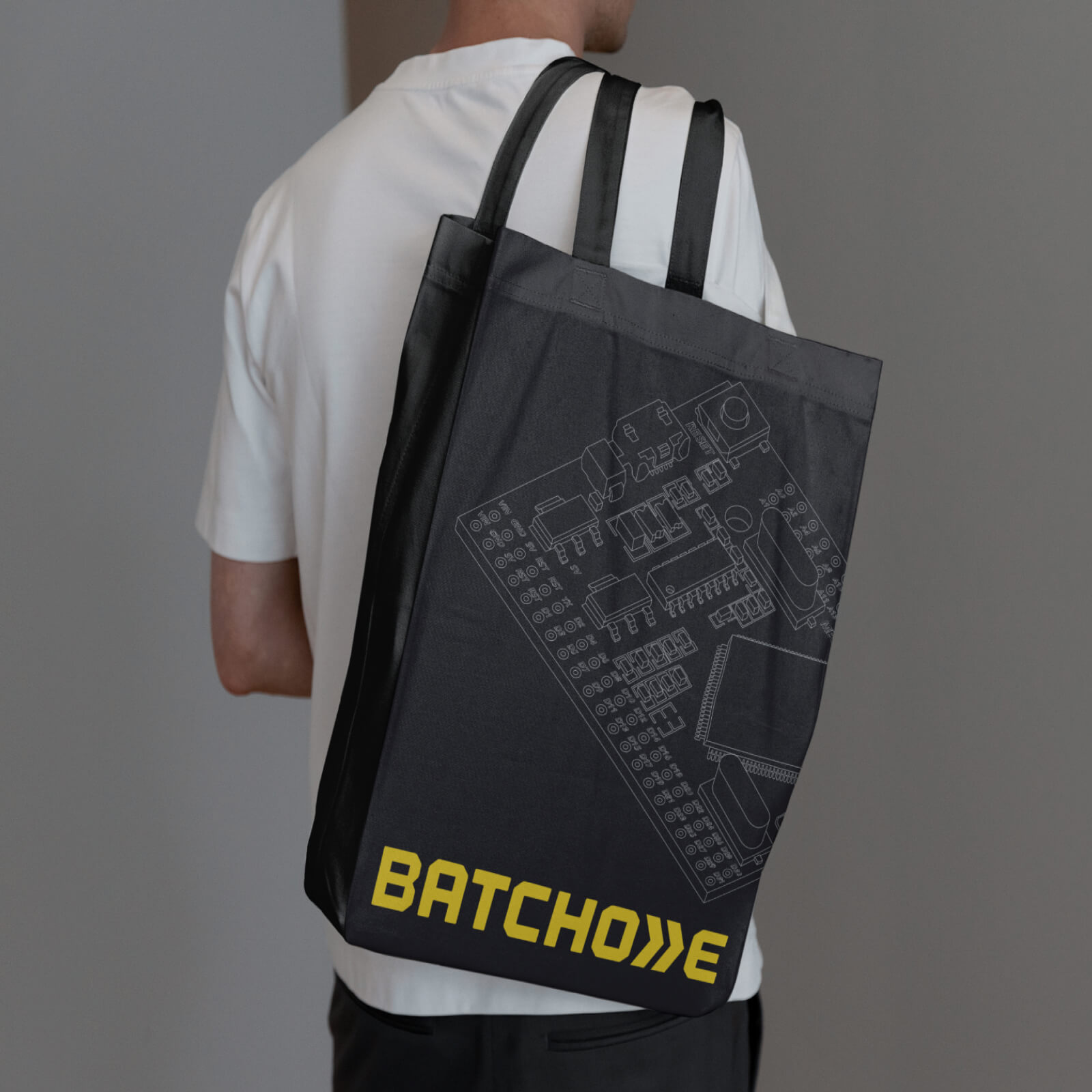
The new identity carried beyond the site. Pitch materials, signage, and collateral all moved into the same visual system, giving BatchOne a cohesive presence across digital and physical touchpoints — and a more honest one. The brand now reads the way the team actually works.

Reflections
What surprised me was how much of this project was internal work disguised as external work. The visual system had to be defined, but the harder thing was getting agreement on what the company actually did and how to describe it cleanly. Once that conversation was had, the design followed.
Design clarity tends to follow organizational clarity. If you're struggling to express something visually, it's often because the underlying decision hasn't been made yet.
Selected Work
Bluesphere AppDigital health app UX/UI

Digital Delivery BookApp UI/UX