Longtermhealth GmbH • 2025
Bluesphere Health
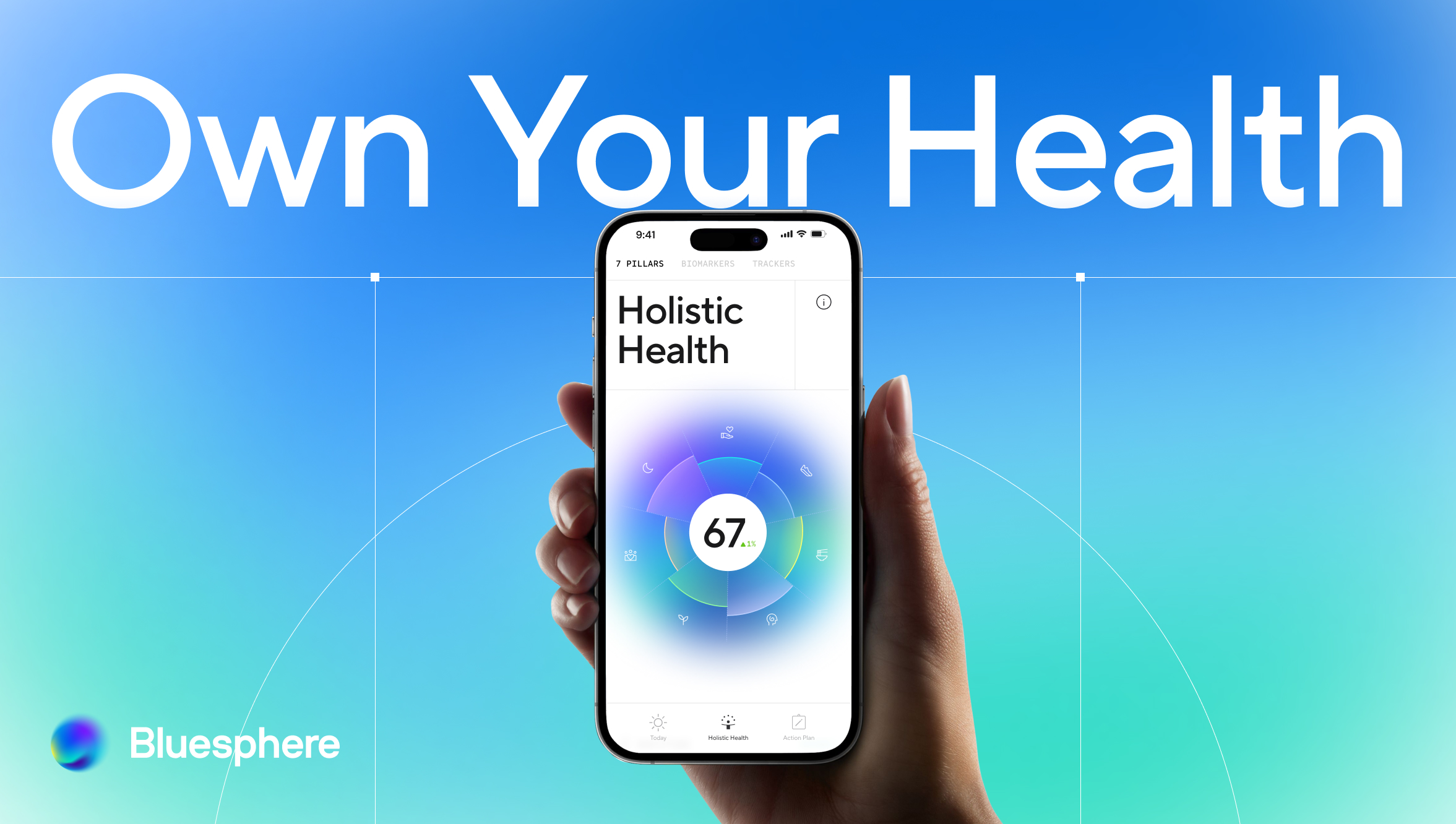
Bringing structure to a product being built in all directions at once. Seven health pillars, one coherent experience.
Scope
Defining & delivering MVP
Team
Project Manager
Backend developers (3)
Frontend developer
Senior UX/UI Designer (me)
Brand designer
Responsibilities
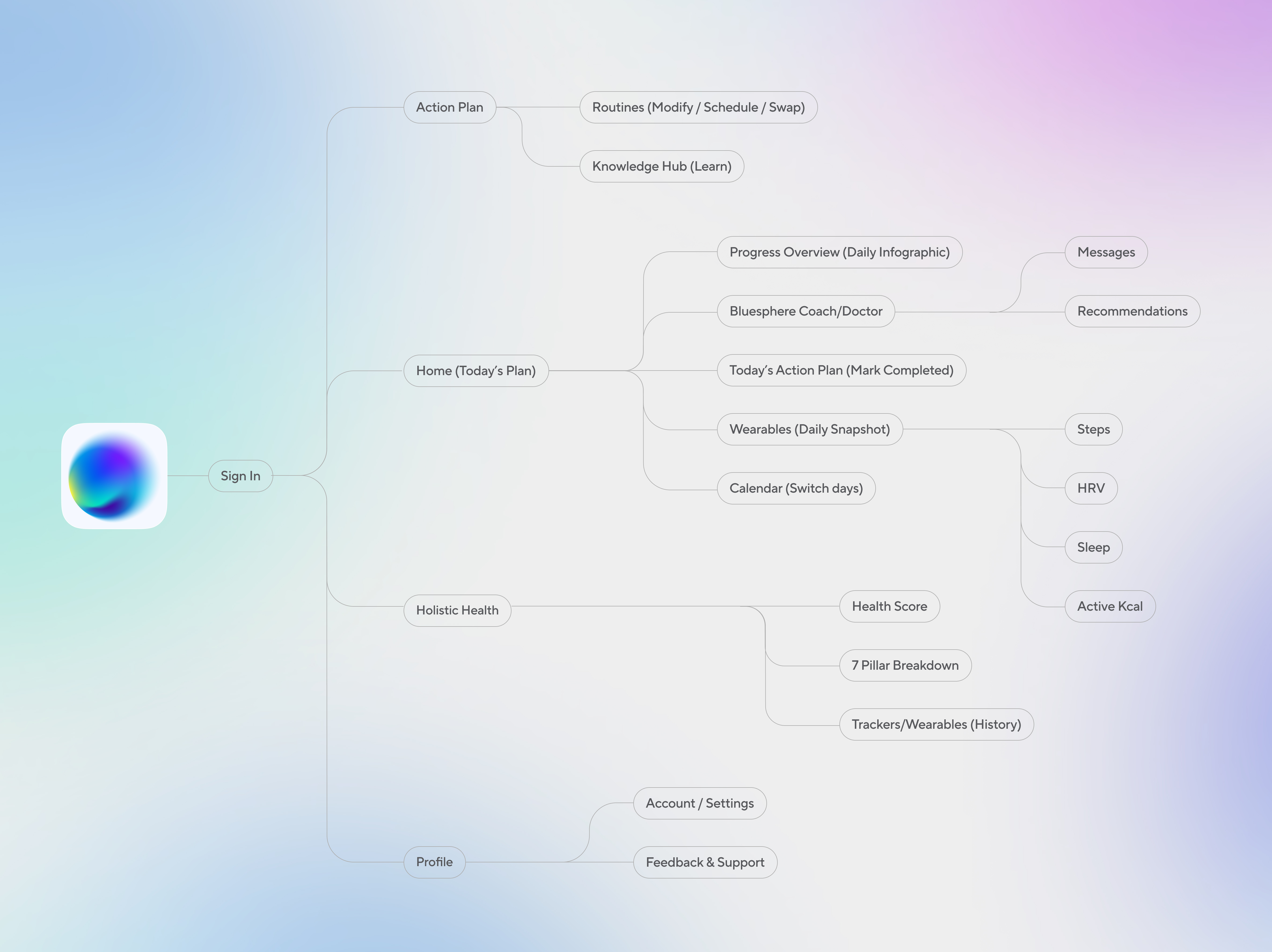
Product structure
User flows
UI direction
User interviews
The Situation
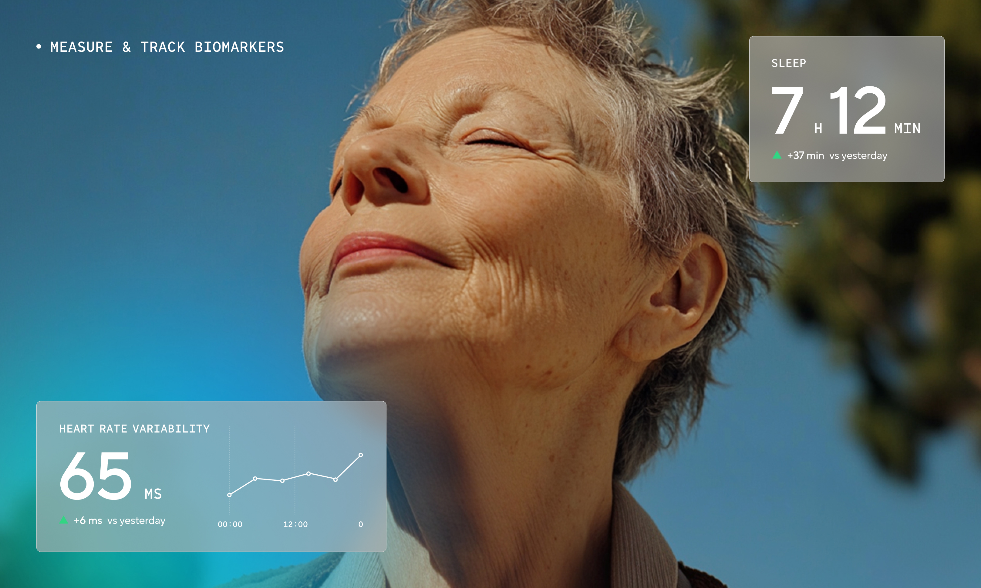
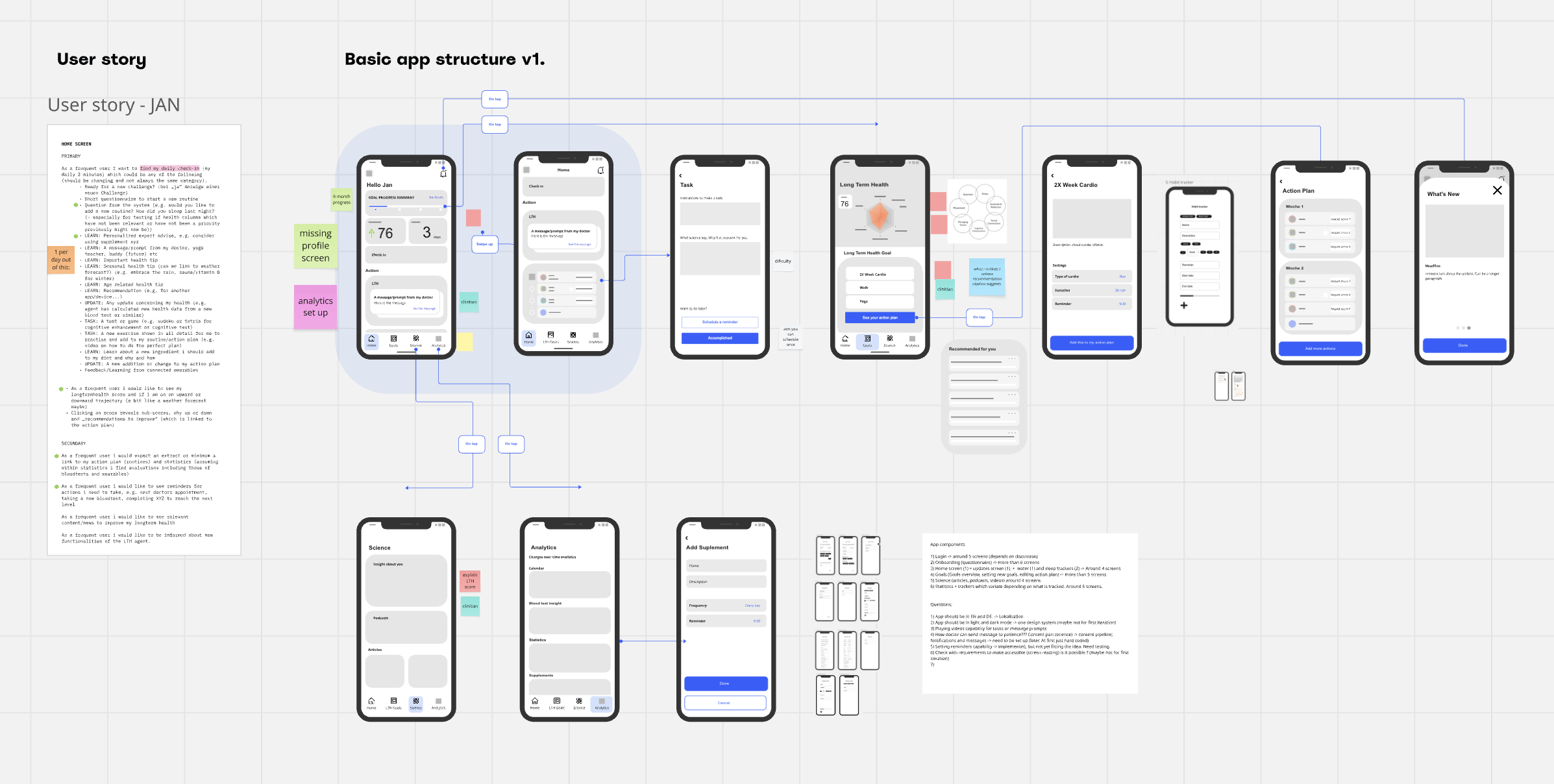
Bluesphere's core promise was ambitious by design: a holistic health app working on all pillars simultaneously — sport, nutrition, sleep, meditation, and more. That's not one app. It's closer to seven, each requiring different logic, different tracking, different interaction patterns. A workout routine needs sets, reps, progression. A meditation practice needs something else entirely. The only way to build this without losing focus was to find what could be shared across pillars and define that structure first.
The product had grown from a strong founder vision without a dedicated design or product function in place. There was a detailed picture of what the app would eventually become, but no shared map of what needed to exist first, what depended on what, or how the pieces connected into a coherent user experience. My role was to bring that clarity.
The Hard Part
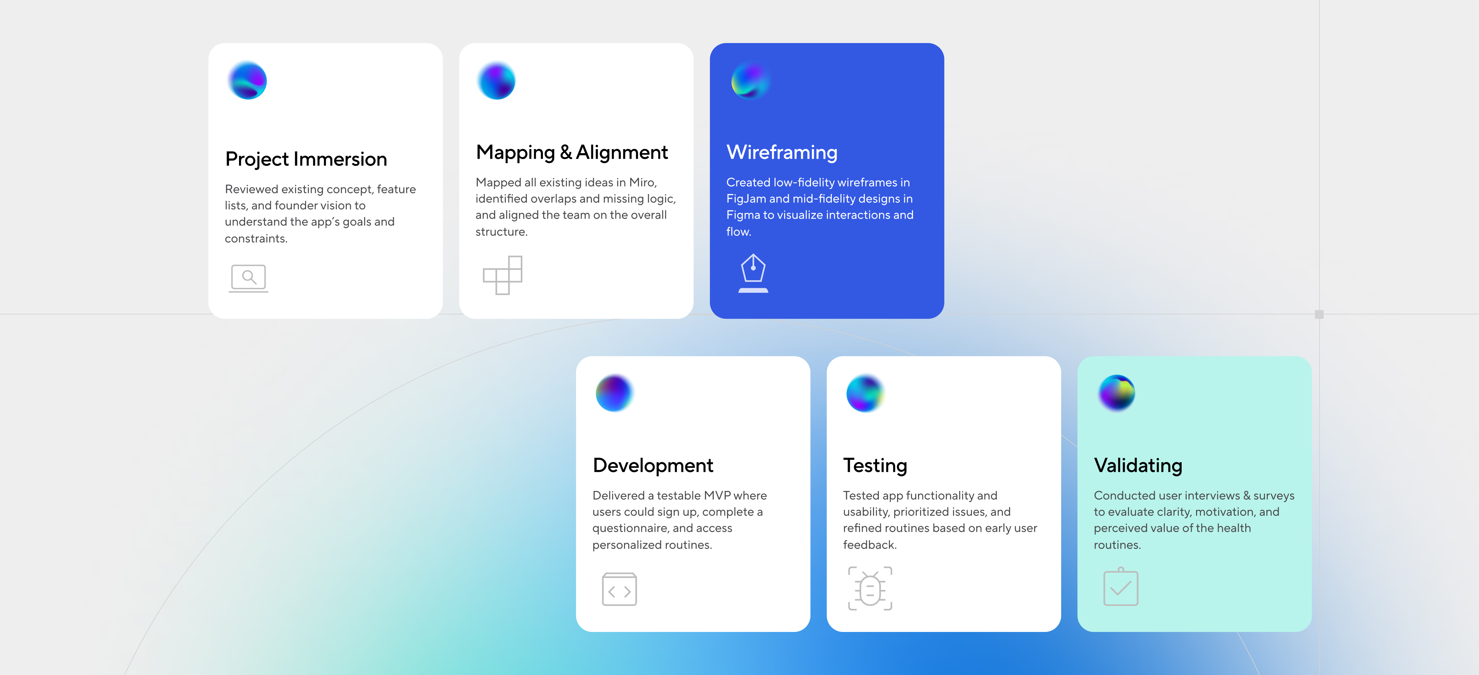
Early on I tried articulating the structural gaps directly in conversation. It was too abstract — hard to act on without something to look at. So I changed approach.
I mapped everything in Miro: every feature, every flow, every dependency, every open question about data and responsibility. Then I walked the team through it. Seeing the full surface area of what we were proposing to build, and being able to trace what needed to exist before something else could exist, shifted the conversation from "when can we build this" to "what do we need to build first."
From there we used FigJam sessions to define flows collaboratively, marking what data was needed at each point and who owned it. Developers, founders, and I were looking at the same picture. That shared picture became the architecture.
What the Work Produced
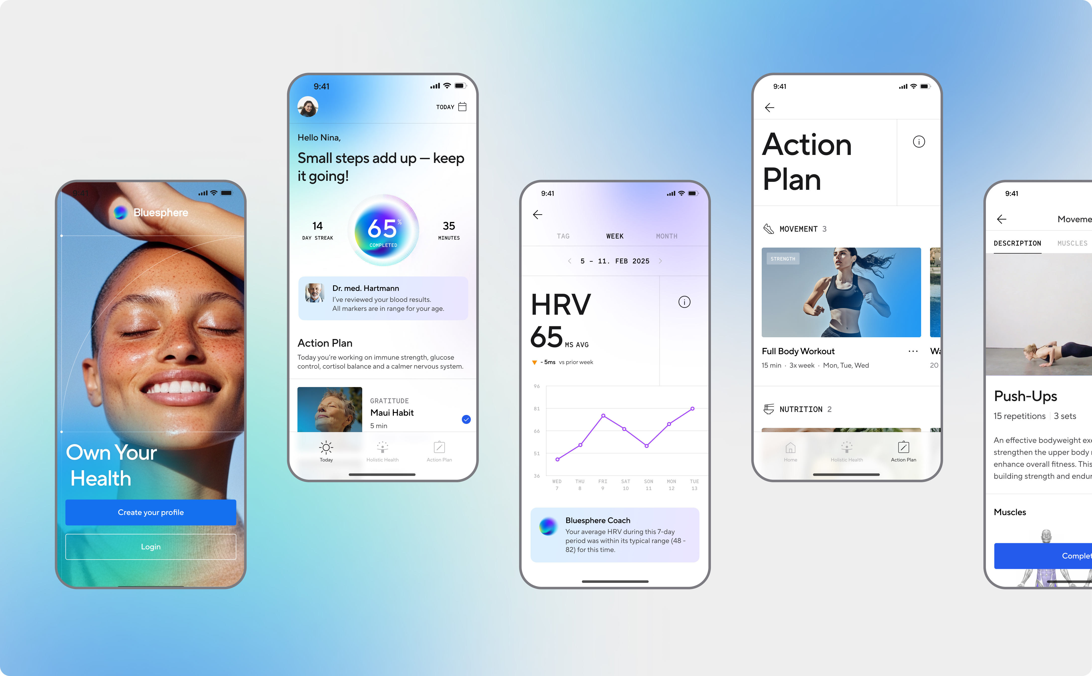
Once we had structural agreement I skipped wireframes and went straight to mid and high fidelity prototypes. The team needed something concrete to test assumptions against, and low fidelity wasn't going to get us there fast enough.
The user interviews that followed complicated the product's core assumption in useful ways. We had designed around someone who didn't know where to start with their health. What we found was more varied: some users were already training for marathons and struggling to find balance; others had tried to move more, overdone it, injured themselves, and quietly stopped. These weren't the same person. They had different starting points, different failure modes, different needs from an AI-personalized routine. That finding directly shaped how we approached personalization and onboarding in the next iteration.
Reflections
Earlier user research would have helped — even lightweight conversations before committing to architecture. We were structuring a product around an assumption about users that turned out to be only partially true. The structure was right; what it was serving could have been sharper from the start.
Selected Work
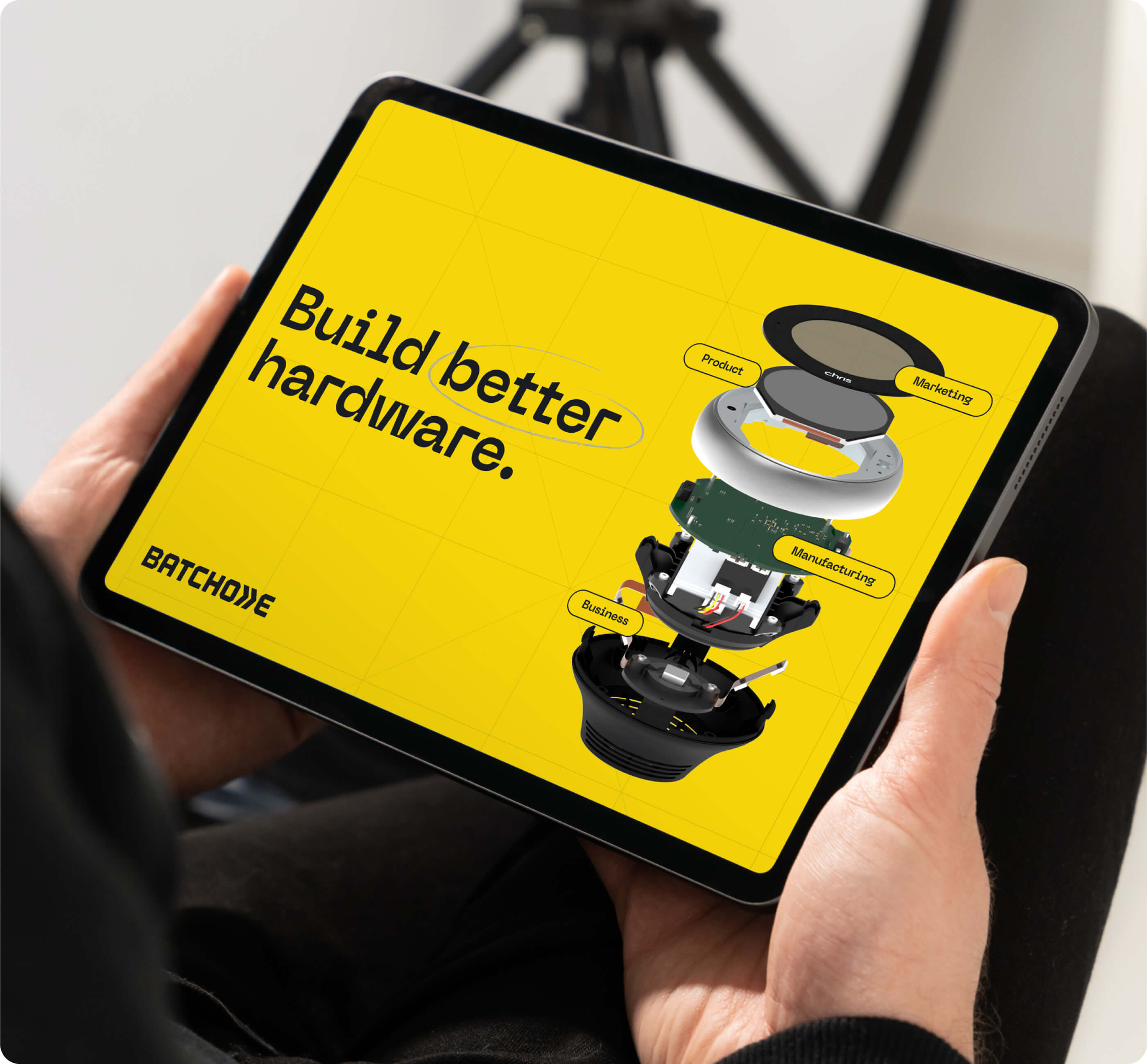
Digital Delivery BookApp UI/UX
BatchOne RebrandBrand identity & website